Where Care Begins With Quality: Behind the Brand Identity for Silo Medical Supply
- luccalilydc

- Oct 20, 2025
- 2 min read
Updated: May 1

When the team behind what would become Silo Medical Supply came to us, they didn’t just need a rebrand—they needed a foundation. No name. No identity. Just a clear sense of purpose and a desire to lead with trust.
Our role was full-scope: naming, brand strategy, and a comprehensive visual identity system. And like every naming project at Lucca Lily, we approached it with equal parts creativity and responsibility.
That meant partnering early with Christian Cipriani, our longtime copywriting collaborator, who led naming and research with the thoughtfulness it deserved. From linguistic nuance to early-stage viability, Christian helped shape the name with both narrative depth and legal foresight.
We also worked with IP attorney Lauren Bercuson to run preliminary legal checks on all top contenders before they were ever presented to the client. Because bold, meaningful names only work if they’re viable—and we believe in setting our clients up for long-term clarity, not short-term compromises.
That’s how we arrived at Silo.
A word that feels grounded. Structured. A quiet nod to support, to containment, to strength. It gave us a narrative platform to build upon, and ultimately led us to a simple but powerful brand belief: Where care begins with quality.
The Brand Identity: Structured Care
Once the name was in place, we began building a brand that could hold its weight—visually, emotionally, and strategically.
Where most medical supply brands lean clinical or cold, Silo needed to feel calm and confident, without ever losing its human touch.
The Logo
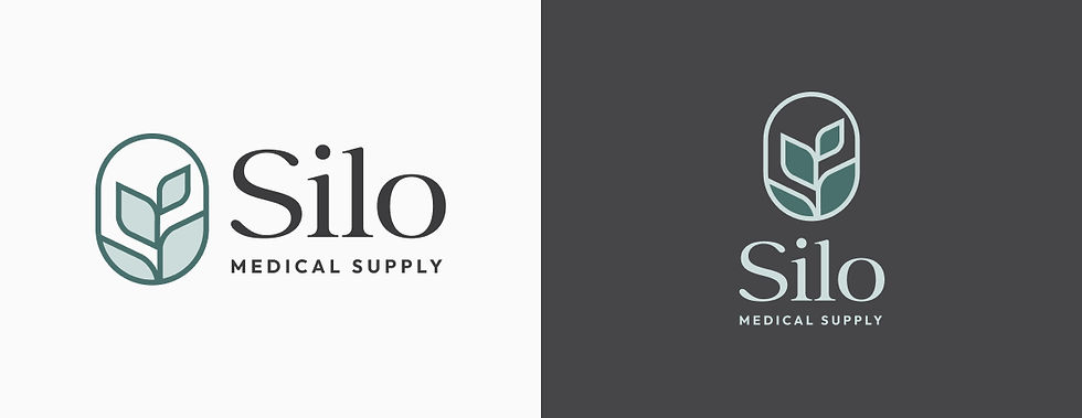
A soft, geometric emblem anchors the identity—a form that hints at a vessel, a shield, a sprouting leaf. It’s abstract enough to stay timeless, but intentional enough to suggest support and care. Paired with a modern wordmark, the full logo system is versatile, recognizable, and quietly commanding.
Color Palette

We leaned into cool, grounded tones:
Misty eucalyptus for calm and clarity
Deep charcoal for depth and trust
Soft mint to evoke freshness without sterility
Together, the palette resists the bright whites and overly technical blues that dominate the category. It feels clean, but never cold.
Typography

We paired Rosemartin, a gentle, trustworthy serif, with Outfit, a clean geometric sans.
Rosemartin brings warmth and reliability—perfect for storytelling, print, and the brand’s softer side.
Outfit ensures digital clarity, packaging legibility, and modern professionalism.
The type system reflects Silo’s balance: approachable, yet precise.
Brand Assets

We brought the brand to life across business cards, collateral, and key touchpoints where trust is built. Every piece is considered, tactile, and true to Silo’s ethos: quiet, confident, and composed.
The Outcome
The final brand system is structured but soft-spoken. It doesn’t try to shout. It doesn’t need to.
Silo was built to reimagine what trust can look like in the medical supply space—and to lead with a quiet confidence rooted in care. From naming through design, every element circles back to a single, guiding idea: Where care begins with quality.
Your Next Move Starts with Strong Branding
Whether you’re starting from scratch or ready for a refresh, we’ll help you build a visual identity that turns heads and builds connection.


I wanted breast augmentation but was terrified of looking fake or overdone. This page gave me exactly the information I needed. In the middle of my research, https://partingtonps.com/how-to-get-subtle-natural-looking-breast-augmentation/ became the resource that stood out. Dr. Mark Partington shares how to achieve subtle, natural-looking breast augmentation using techniques like the ON TOP® method, careful implant selection, and personalized planning. Many patients say it helped them feel confident about getting beautiful, proportional results that look like “them” just enhanced.
After starting to use reading glasses, everything close-up looked sharp but distance vision felt off and blurry. This page finally made sense of what was happening. In the middle of my research, https://optyx.com/why-is-my-vision-blurry-after-using-reading-glasses-insights-from-optyx/ became the resource that stood out. It clearly covers why blurry vision can occur after using reading glasses, including adjustment periods, incorrect magnification, and signs that you may need a full prescription update. Customers often mention it helped them figure out whether to keep using the glasses or book an eye exam.
This resonates with me because a few years ago, I was looking for exactly this approach in medicine: not just "take a pill," but for someone to understand my fatigue, loss of strength, and constant feeling that my body was on pause. I realised that low testosterone is not just a matter of "age," but something that can be effectively corrected. Then I came across https://ways2well.com/blog/finding-the-best-testosterone-replacement-therapy-doctor-near-you — and it was a logical next step: they explain how to find a doctor who will not just prescribe medication, but will perform a full diagnosis, develop a personalised plan and monitor the results. After several months on TRT, my energy returned, my mood stabilised, and most importantly, the feeling that I was…